Project: Logo Design + Billboard Design
Challenge
Padel is an exhilarating racquet sport that has captured the hearts of enthusiasts worldwide, offering a perfect blend of excitement and camaraderie. New Padel courts in George, South Africa, needed a distinct brand identity and billboard to express the sport's lively spirit.
Solution
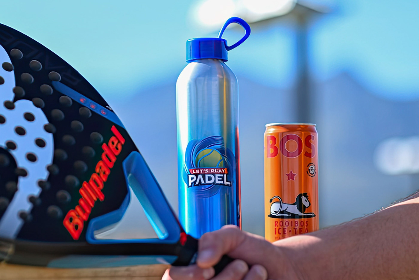
A logo that radiates fun and playfulness while maintaining its association with sports. It had to be versatile and accommodate future branding needs such as signage, clothing printing, bottles, and accessories as the company expanded.
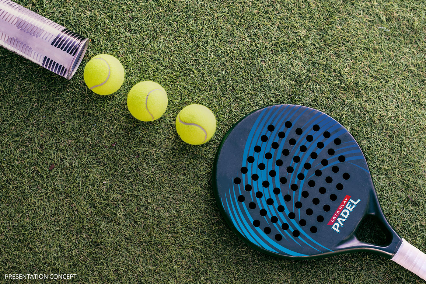
I sought a visual focal point, distinct from human silhouettes or paddle rackets as most competitors have done. I found inspiration in the Padel ball itself. To convey dynamism, I crafted swirling patterns, envisioning an element that could stand alone and harmonise with the central visual.
For the billboard design, I used coloured bands, mirroring the ball's bounce, creating a striking visual effect. They provide a canvas for inserting engaging images between each bounce, enhancing the billboard's visual appeal.
Result
The "Let's Play Padel" project captures the essence of Padel's excitement and camaraderie through thoughtful branding and a captivating billboard design.